Edison Cafe Menu Cover's

For this menu cover, I kept the target audience in mind from the beginning. The food was prepared by students training to become chefs, while the customers were mostly high school students, so I wanted the design to feel fun rather than overly formal. Since the inside of the menu was going to be simple and light, I used the cover as a chance to create something more energetic.
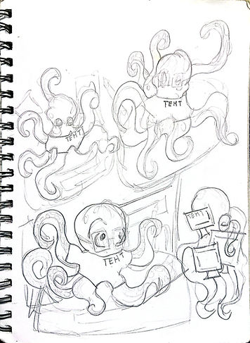
Sketches & Rough Draft


I explored many monster themed ideas in my sketches, including terrifying burgers and objects being pulled into a vortex. In the end, I chose the dragon because it matched the personality of the cafe best. I focused on visual hierarchy and contrast so that the cover would grab attention quickly. Seeing the final design printed as a menu and a poster was one of my favorite parts of the project.

This edison Cafe menu cover was based on a student's request for an octopus holding food. I placed the octopus directly in the center to create a strong focal point and arranged the food around it to keep the composition balanced.
I used warm colors to make the food feel more appetizing and to give the design an inviting look. I also focused on contrast and movement so the viewer's eye would naturally travel around the octopus and the different food items. The final design was later used as both a poster and a QR code display for the cafe.
Sketches & Rough Draft